· Resource · 2 min read
Science of Color
How to make figures readable to all! Including the colorblind.

Color theory is a behemoth, involving optics, spectroscopy, human anatomy and physiology, psychology, art history and theory, philosophy, ethics, architecture theory, design, and many other applied sciences that all influence color theory. In this post, I will focus on how to use color in scientific figures, with a focus on keeping it colorblind-friendly (and pretty).
Two good resources are and references are science of color theory, nature methods, and friendly colors for the colorblind.
To increase contrast, it is good to use complementary colors, that is colors that oppose each other in the color wheel. But be careful to use it for highlighting and not everything! 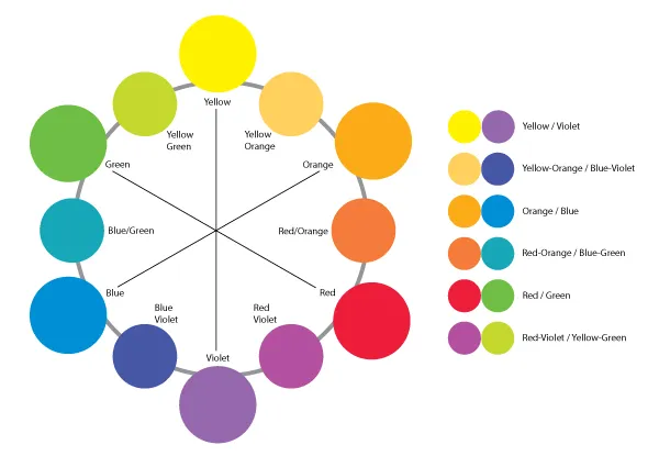
But what about the colorblind? Chances that one of your reviewers is colorblind are high!
“In individuals of Northern European ancestry, as many as 8 percent of men and 0.5 percent of women experience the common form of red-green color blindness. If a submitted manuscript happens to go to three male reviewers of Northern European descent, the chance that at least one will be color blind is 22%!”
It is important to represent your data in the best possible way, and this includes taking other people’s limitations into account. Choosing colors is part of clear presentation and can help get your data published.
This color scheme is suitable for colorblind reviewers: 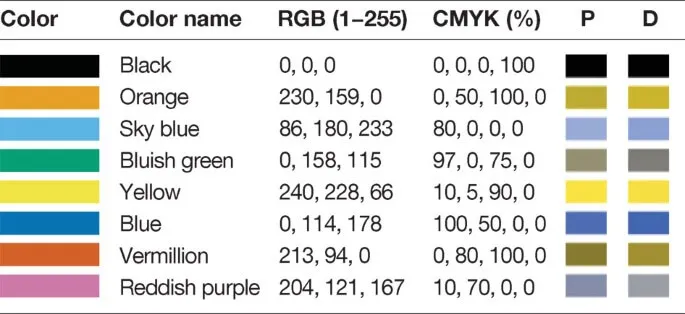 P and D indicate simulated colors as seen by individuals with protanopia and deuteranopia, respectively.
The following color wheel illustrates how to use these colors in complementary ways to increase or decrease the contrast. 
It is a relatively small effort to adjust your colors, especially if you make your figures in Illustrator or Affinity Designer (highly recommend). Download the color palette files in Apple Color List (.clr) format.
To use these colors in your figures, here are the hex codes:
#CC79A7
#D55E00
#0072B2
#F0E442
#009E73
#56B4E9
#E69F00
#000000
I wish nice reviewer comments to everyone and maybe this tip can prevent some misunderstandings about your data!