· Resource · 1 min read
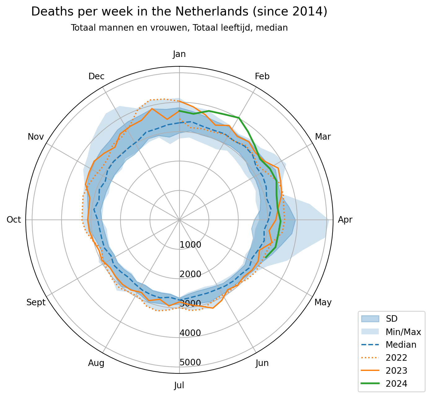
Excess mortality in the Netherlands
Mortality in the Netherlands before during and after covid.
Notice: The graphs in this blog update automatically through a python script that fetches the data weekly from the cbs (central bureau of statistics in the Netherlands) via github-actions each Friday at 4am.

 To assess the effect of the pandemic in an unbiased way I started this hobby project that pulls mortality data from the CBS. The code is available on github. Weekly deaths are plotted and compared with the data from the last 10 years, no fancy corrections or classifications, just data.
The challenge was mainly in correctly plotting the data from the first and last weeks of the year. In most graphs (also from the government) these weeks are often ignored, but if your plot is circular it has to match (or the data will look weird). This was a good way to learn python and especially pandas. I would encourage everyone who wants to learn anything with python to just try and do it, so many little problems you don’t learn otherwise. The median, SD and min-max data exclude 2020 and 2021 since these are the (covid) years of interest.
You can also split the data based on sex and age-group: