· Resource · 4 min read
Greater legibility
How to make figures readable to all! Including the dyslectic.
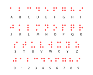
To make my science more accessible I now use Atkinson Hyperlegible as a font whenever I can, in addition to the colorblind friendly pallet! Implementation of this font by journals and funding agencies would not only help visual impaired scientists but make reading less strenuous for others. Fewer mistakes will be made by reading an upper case i as an l for example, a common mistake.
More information on the font can be found below, at the braille institute and Applied Design Works websites.
To prevent readers from confusing the uppercase “B” and number 8, Atkinson Hyperlegible makes use of different geometric shapes.
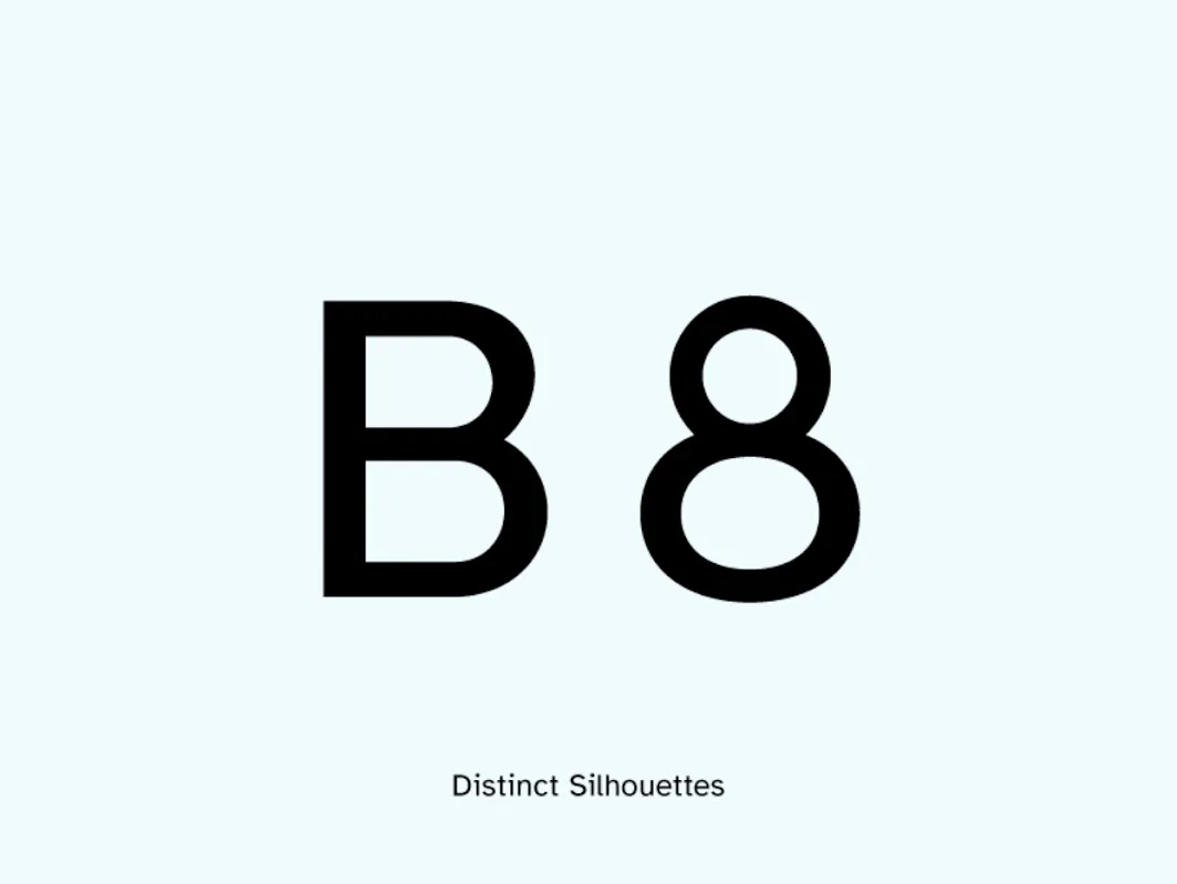 The number 8 has a small circle on top of an oval, making it look very different from the uppercase “B” with its two bowl shapes.
To clarify potential misreading, some letterforms are exaggerated.
Atkinson Hyperlegible is a sans-serif typeface. However, the type designers added selective serifs to increase legibility for certain letterforms.
Increased spaces prevent forms from bleeding together.
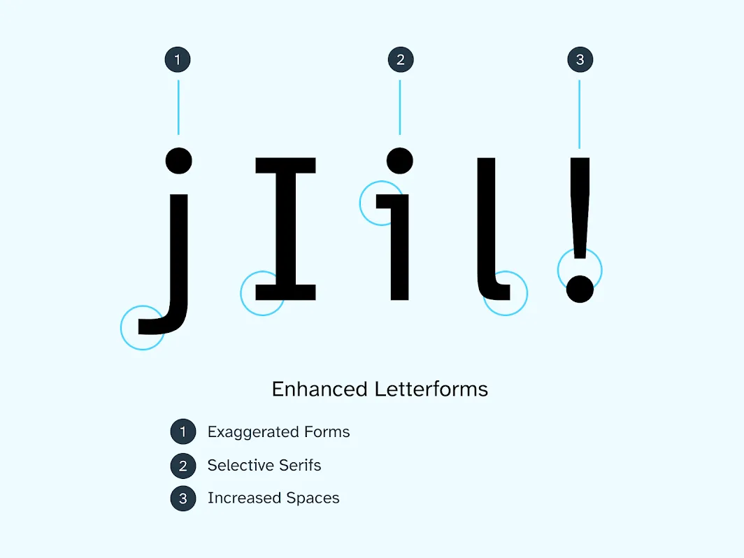 The lowercase “j” has an exaggerated tail, the uppercase “I” has serifs. The lowercase “i” has a spur on the top left of the stem. The lowercase “l” has a curved terminal at the bottom right. There is more space than usual between the bottom of the exclamation mark and the dot.
Lowercase b, d, p, and q are commonly confused letters because people can flip the letters in their heads. To increase letter recognition and define a distinctive style, Atkinson Hyperlegible has asymmetrical spurs. The typeface’s exaggerated descenders help distinguish letterforms from one another.
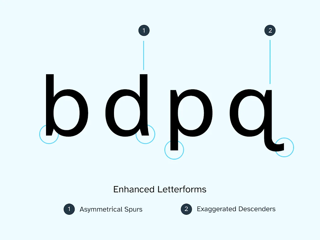 To differentiate between the lowercase b and d, Atkinson Hyperlegible has an asymmetric spur on the “d”. To make the lowercase “p” and “q” distinct, the lowercase “q” has an exaggerated descender.
The type designers wanted to make the font attractive to people who were losing their vision and still appeal to a wide variety of audiences.
“The problem is that often fonts that are designed for low-vision readers are difficult for readers without vision impairments to read,” explained Elliott Scott, Creative Director at Applied Design Works. “Characters are too exaggerated or drawn in unconventional ways. One of the goals of Atkinson Hyperlegible was to develop a font that readers without vision impairments could easily read too, and ideally not realize they were reading with a ‘legibility’ font.”
The goal of making a product both accessible and appealing is common in the field of accessibility. Those with disabilities don’t necessarily want “the accessible product” that sets them apart from everyone else. They want to use the same products that other people do. This is similar to how people who need extra support for their feet may avoid wearing bulky and comfortable orthopedic shoes that are not fashionable.
Expanding the font to the Latin extended alphabet presented the designers with another challenge: how to avoid the problems of the letterforms blending and blurring together with accent or diacritic marks.
To reduce crowding between letters and diacritics, the designers used these four techniques:
- Circular shapes instead of square-like marks
- Increasing the space between the letter and mark
- Making the marks larger than usual
- Increasing the contrast between the letter and mark
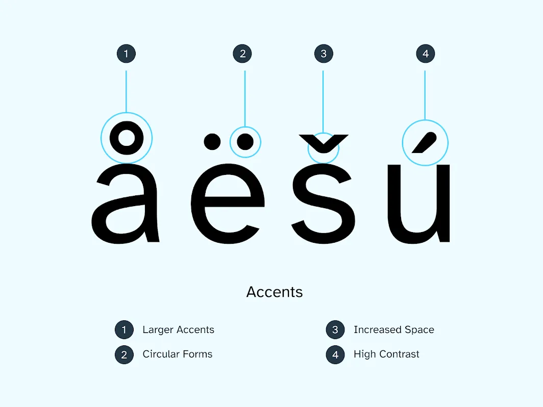 For extended Latin, the typeface uses large diacritic marks, circles to reflect the Braille origins of the font, increased space, and high contrast between the letter and diacritic mark.
Beyond improving readability, the type designers see the font as a way to build awareness about the needs of people with vision impairments. “It really is as much about the conversation as it is about the font. As people age, they may have a harder time seeing. When people talk about how they tried out this font to help them read better, they are opening up about their vision problems and it becomes less taboo or uncomfortable to discuss reading and visual difficulties,” said Brad Scott, Founder and Managing Director at Applied Design Works.
“I’d love for Atkinson Hyperlegible to be able to help readers across the vision acuity spectrum to be able to continue—or return to—reading,” said Elliott Scott.
“Braille Institute’s mission is to positively transform the lives of those with vision loss and we therefore decided to make the font available for anyone to use without cost,” said Sandy Shin, VP of Marketing & Communication at Braille Institute. “We would love Atkinson Hyperlegible to be ubiquitous and to help those with low vision continue to enjoy the written word.”
Adapted from: Susanna Zaraysky
